
Global food trade, heat deaths, paying for CO2 emissions, and more
A twice-monthly digest of our latest work plus curated highlights from across Our World in Data.


Welcome to The OWID Brief! In this edition we cover:
Our interactive tool helps you see how food gets traded around the world
Around 30% of the world’s emissions have some carbon price, but how much extra are people paying?
How many people die from extreme temperatures, and how this could change in the future?
A detailed analysis of millions of users on X asking “@Grok is this true?”
… and more. Check it out! ⬇️
🆕 OUR RECENT PUBLICATIONS AND UPDATES
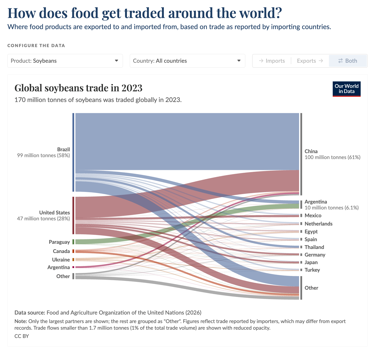
Our interactive tool helps you see where food is exported from and where it goes
Head to the local supermarket, and many of us will find foods shipped in from all over the world. Perhaps bananas from South America, cocoa beans from West Africa, or citrus fruits from Southern Europe. The world of food is a very globalized one.
Which countries do others depend on for the wide range of foods available to them?
To see how and where food is traded across the world, our colleague Sophia Mersmann built an interactive visualization that shows the flow of different types of food from producer to consumer.
This allows us to see who the largest trading partners are for any particular food, from almonds to soybeans (shown here) to yogurt. It also allows us to zoom in on any country to see what countries they rely on, either as places they import from or countries they export to.
Explore the interactive version of this chart →
Around 30% of the world’s emissions have some carbon price, but how much extra are people paying?
To actually be effective, carbon prices need to be high enough to change consumption patterns, incentivize innovation, or make cleaner alternatives cheaper.
When we look at the actual price people are paying for their emissions, we see that it’s often too small to make much difference.
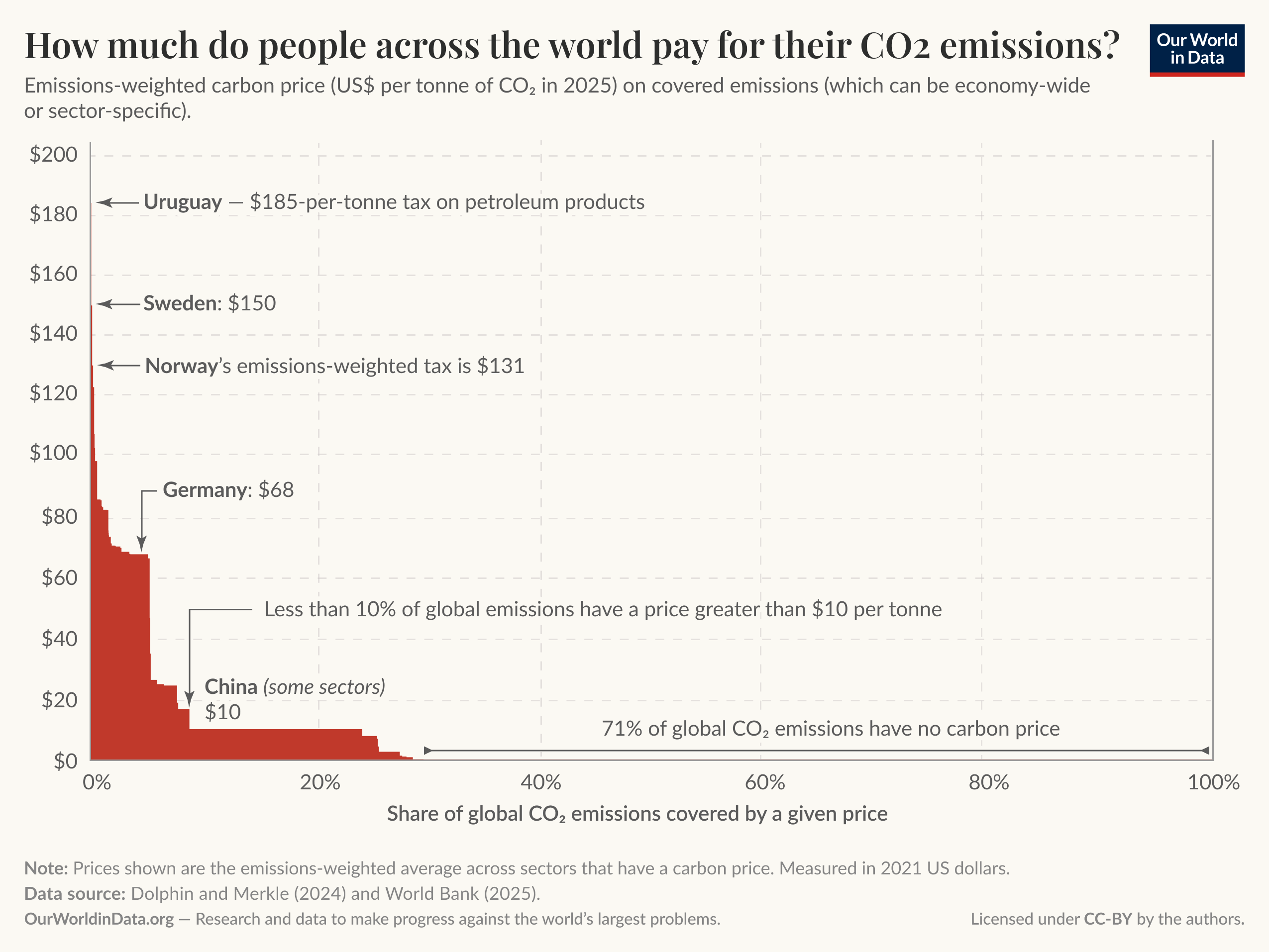
First, how much do carbon prices actually change what we pay for energy? At $5 per tonne of CO₂ — typical of many markets — the cost of a liter of petrol rises by less than 1%. That’s nothing compared to the regular ups and downs of oil prices.
It’s only at around $100 per tonne, roughly the median estimate of the damage caused by a tonne of CO₂, that prices start to register: a 15% increase on petrol.
Only a few countries charge more than $100, and they account for less than 0.5% of global emissions. Most of Europe sits in the $65–90 range, and most carbon markets charge less than $10.
71% of emissions have no price at all.
Learn more in the new article by Hannah Ritchie and Pablo Rosado.
📈 DATA INSIGHTS
Bite-sized insights on the world and how it’s changing
Since our last OWID Brief, we’ve published insights across various topics. Here’s a selection:
US and Chinese companies train almost all of the world’s most-used AI models →
Europeans consume more milk and dairy products than people in other regions →
A woman’s risk of dying in pregnancy or childbirth varies hugely by country →
Obesity rates in Pakistan have tripled in the last 20 years →
Subscribe to our Data Insights newsletter
Our dedicated Data Insights newsletter delivers new insights right to your inbox every few days.
🌟 EXPLORE OUR FEATURED WORK
How many people die from extreme temperatures, and how this could change in the future?
Think about someone dying from extreme temperatures. You probably pictured someone passing out from heat stroke or dying from hypothermia.
But this is not how most people die. They die from conditions such as cardiovascular or kidney disease, respiratory infections, or diabetes.
Almost no one has “heat” or “cold” written on their death certificate, but researchers estimate that sub-optimal temperatures lead to several million premature deaths every year.
Most of these deaths occur in people older than 65, as older populations are usually most vulnerable to extreme temperatures.
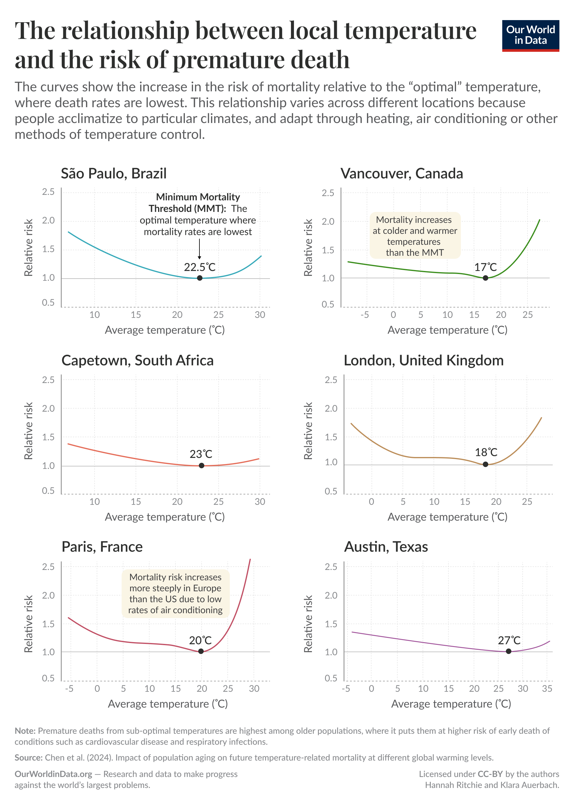
To estimate these deaths, researchers use real mortality records to understand “excess mortality” — how many “extra” deaths occur above a given expected baseline — at different temperatures.
Plot this increased mortality risk against temperature, and you’ll find a U-shaped curve. You can see this in the chart here for a selection of cities from across the world.
Hannah Ritchie wrote an article that examines how many people die from heat and cold each year and how researchers estimate these numbers. In a follow-up article, she looked at how these risks could change due to climate change.
From our classics
📖 WHAT WE’VE BEEN READING

@Grok is this true?
As most of us know, sorting fact from fiction on social media can be hard.
To help, people are increasingly turning to AI chatbots such as Grok, which can be tagged in posts on X to reply there.
A working paper by Thomas Renault, Mohsen Mosleh, and David Rand offers the first large-scale look at this practice.
They analyzed almost 19 million messages sent to Grok and another bot, Perplexity, on X between February and September 2025.
The researchers found that of these messages, nearly 8% were fact-checking requests, covering a wide range of topics. The most common form was simply asking, “@grok is this true?”
Accuracy, however, was mixed: the bots agreed with professional fact-checkers just over half the time, short of the 64% agreement among the fact-checkers themselves.
Still, the authors see potential in fact-checking at this speed and scale, especially as models improve, and call for clearer standards and safeguards.
– Charlie
The case for higher poverty lines
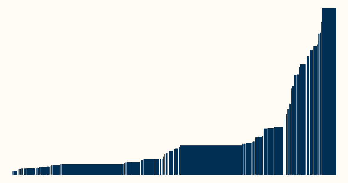
The World Bank’s “$1-a-day” extreme poverty line (revised upward since its inception in 1990) helpfully draws attention to the world’s poorest.
But, as economist Lant Pritchett argues in a recent piece in VoxDev, it is a very low bar that unhelpfully splits the world into two groups — “poor” and “not poor”.
This split means a Bangladeshi family just above the poverty line and a typical family in Denmark are counted exactly the same way: “not poor”.
In a recent paper with Martina Viarengo, Pritchett proposes adding a higher global poverty line, above which no one could reasonably be considered poor, wherever they live. Using four different approaches, they estimate that the line falls between $20 and $40 a day.
Our founder, Max Roser, has also emphasized the need for a higher poverty line, arriving at $30 a day.
As Pritchett puts it, “The point is not to conflate different degrees of deprivation, but to ensure that the near-poor and the moderately poor are not simply written out of the global development agenda”.
– Bertha
The mission of Our World in Data is to increase understanding of the world’s largest problems and drive informed action to solve them.
We are a nonprofit, building Our World in Data as a public good that’s freely available to everyone. Help us do more by supporting us with a donation.
Just wanted to say that your food trade tool is so cool! I'm planning to use it in my global food systems class!