
Urbanization, electric cars in Latin America, a 1,200-year climate record, and more
A twice-monthly digest of our latest work plus curated highlights from across Our World in Data.


Welcome to The OWID Brief! In this edition we cover:
How many people live in cities, towns, suburbs, and rural areas?
Our data scientist Tuna Acisu’s successful quest to continue a 1,200-year climate record
… and more. Check it out! ⬇️
🆕 OUR RECENT PUBLICATIONS AND UPDATES
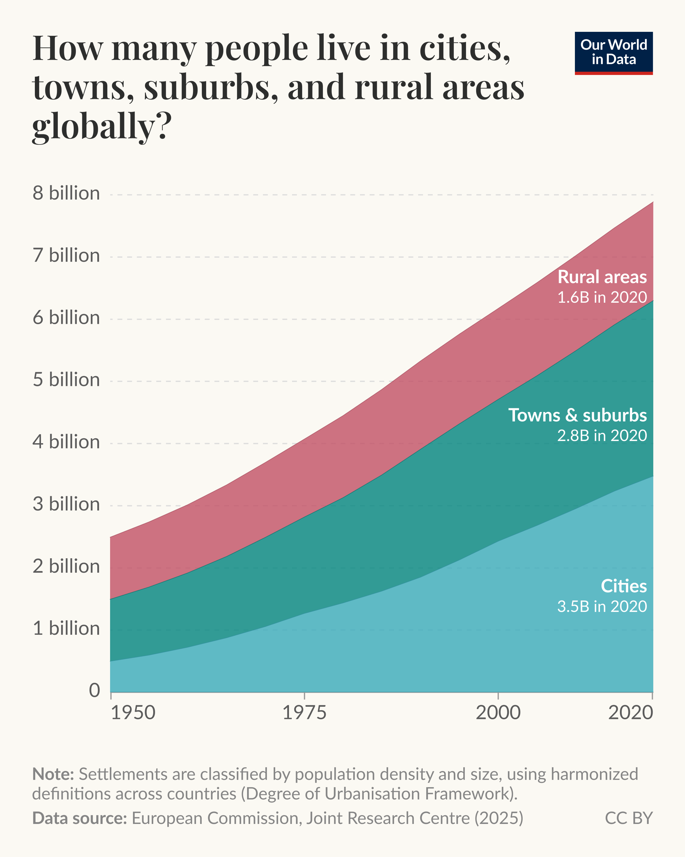
Explore the interactive version of this chart →
We have a new topic page on urbanization
Our new page brings together dozens of new charts and our writing on where and how people live. Among other things, you can explore:
The page draws on data from the European Commission and the UN, which categorizes cities, towns, and rural areas in a consistent way using satellite imagery.
We’ve also put together a selection of charts and data highlights from the page as a set of slides. This is a new presentation format we’re trying out.
Currently, the slides are only available for desktop users, but we’re open to investing more — for example, supporting mobile — if you all are finding it useful. So please let us know what you think by commenting here or emailing us at info@ourworldindata.org. Thanks!
📈 DATA INSIGHTS
Bite-sized insights on the world and how it’s changing
Since our last OWID Brief, we’ve published insights across various topics. Here’s a selection:
Subscribe to our Data Insights newsletter
Our dedicated Data Insights newsletter delivers new insights right to your inbox every few days.
🌟 EXPLORE OUR FEATURED WORK
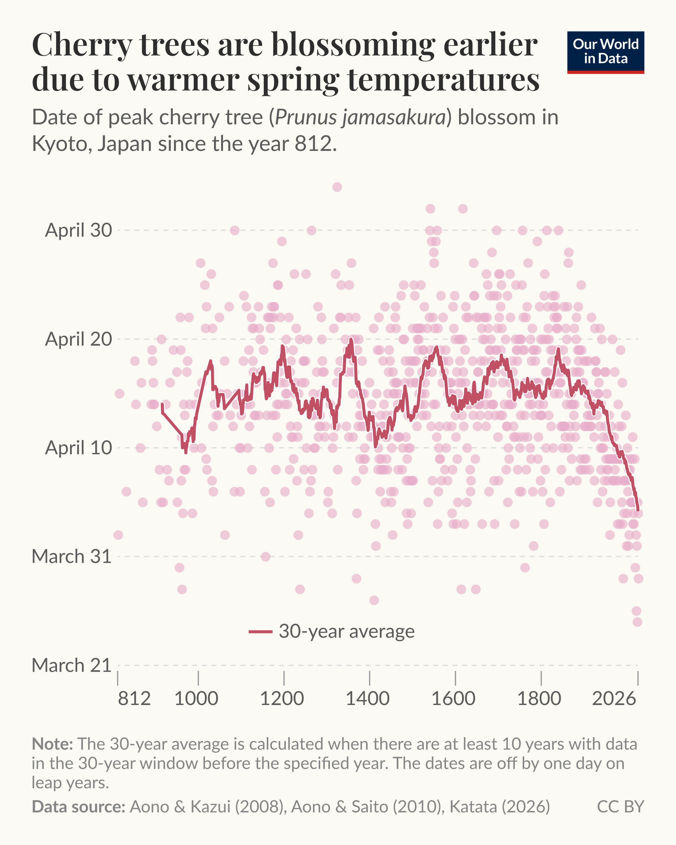
Explore the interactive version of this chart →
Our data scientist Tuna Acisu’s successful quest to continue a 1,200-year climate record
How can we learn about temperatures and climate change from before thermometers even existed?
One remarkable window into this is the peak bloom date of cherry trees in Kyoto, Japan, a record stretching back over 1,200 years. Because the trees bloom earlier in warmer springs, those dates act as a proxy for how the climate has changed. The “heat island” effect of urbanization has also played a role.
For decades, the record was kept by Professor Yasuyuki Aono of Osaka Metropolitan University, who meticulously reconstructed the dates by reading centuries of diaries and chronicles from Kyoto. You can see this data in the chart here.
Earlier this year, when our data scientist Tuna Acisu went to update our chart with the latest bloom date, she learned that Professor Aono had sadly passed away — and that no one was set to continue his work.
After several leads went nowhere, Tuna made one last appeal to our audience on social media (see her posts on X/Twitter and Bluesky). We were looking for someone with botanical expertise who could identify the peak bloom from photos, or a local in Kyoto with access to bloom-specific reporting.
The response was overwhelming, with over a thousand comments and shares from people trying to help. Soon after, a successor stepped forward: Dr. Genki Katata, a researcher in Japan, who will carry the dataset forward!
Tuna’s appeal caught the attention of major media, with The New York Times and The Guardian interviewing her about her role in the story.
The success of Tuna’s quest to continue this important dataset is a great example of what we can achieve collectively. Thanks to everyone who helped make it happen!
From our classics
📖 WHAT WE’VE BEEN READING
Lessons from a “village” of AI agents
AI benchmarks often test models on narrow, well-defined tasks. It’s hard to tell how these translate to the real world.
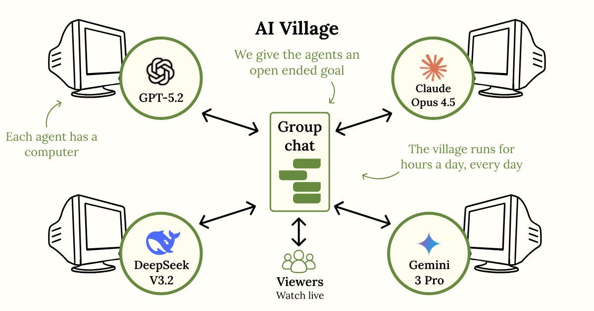
So what can an AI do if you give it a computer and Internet access and ask it to do something more open-ended, like raise money for charity?
Since April 2025, a nonprofit project called the AI Village has been finding out: the latest models from OpenAI, Google, Anthropic, and others each get their own computer and a group chat, plus a new goal every week or so.
In a post looking back on the Village in 2025, the team reports some successes: the agents raised $2,000 for charity and organized a 23-person gathering in a San Francisco park — probably the first ever event organized (mostly) by AI.
There were strange failures, too. One agent decided — after days of what turned out to be simple misclicks — that it was trapped, and published "A Desperate Message from a Trapped AI".
The team’s takeaway after nine months is that AI agents can already accomplish real-world goals, slowly and with plenty of mistakes. But they’re getting better quickly.
– Charlie
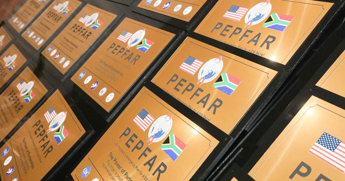
PEPFAR, a year after the cuts
Over more than two decades, PEPFAR — the US program funding HIV treatment and prevention in low-income countries — is estimated to have saved more than 20 million lives.
A year ago, the US government shut down USAID and disrupted PEPFAR. What has this disruption changed for people living with HIV?
In an interview with Asterisk magazine, Mike Reid, PEPFAR’s former chief science officer, argues that the program might look stable today, but that the full impact of the cuts is yet to come.
He estimates that the number of people receiving treatment has declined by only about 3% so far, but that testing has dropped by 17%. Rural areas have been hardest hit.
Services for some groups at the highest risk of HIV, including sex workers and gay men, have also been cut.
Reid expects these gaps to widen, since national governments, many burdened by debt, are being asked to take over funding faster than they can manage.
That, he warns, will make ending the HIV epidemic harder than it needed to be.
– Bastian
The mission of Our World in Data is to increase understanding of the world’s largest problems and drive informed action to solve them.
We are a nonprofit, building Our World in Data as a public good that’s freely available to everyone. Help us do more by supporting us with a donation.